Authors: Silvia Eunice Gutiérrez De la Torre
Category: Paper:Short Paper
Keywords: data visualization
New Maps for the Lettered City: a Data Visualization Exploration of 19th Century Salons in Mexico
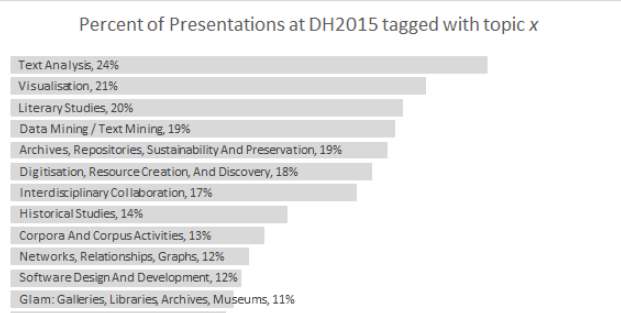
Visualizations have a central role in the Digital Humanities. The second most popular author-chosen topic word of DH2015 was visualization (cf. Figure 1 from Weingart, 2015). Yet, when one revisits all accepted abstracts at DH2015 with the keyword “vis(z)ualization”, one may notice that not many of these texts indicate which libraries were used for interactivity (only some mention D3), and even fewer had direct links to their websites for testing (many were prototypes).
One of the more common visualizations are those of relational data. In Katrien Verbert’s more thorough survey of interactive visuals in DH2014's presentations, relations-visualizations represent 50% of all prototypes (that is 29 out of 58). The most popular way to represent relationships are uni- or bi-directional graphs (23 out of 29) and only one of them used a matrix to display connections (see figure 2 from Verbert, 2015). To crack open the discussion on the pros and cons of this visualization technique, I will show how I answered some questions of cultural history, more specifically of Latin American Literary History, with a tailored interactive matrix (to this the visualizations visit: http://www.sgutierrez.seewes.de/).
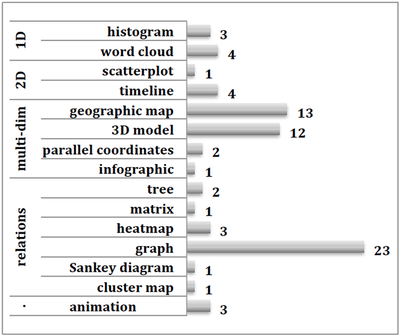
Figure 2. Visualization techniques used by work presented at DH14 (Verbert, 2015)
Theoretical Framework
The history of associations is a goldmine for the intellectual queries of scholars interested in literary and intellectual history. In Latin America, for instance, the appearance of Angel Rama's posthumous book The lettered city (1984), lead to a series of studies concerned with the constitution of enlightened groups, especially in new nation-states. As the capital city of one of the most powerful ex-Spanish Colonies, the lettered network in Mexico City makes an interesting case study. However, despite the valuable monographic studies on this subject (most notably Perales Ojeda, 2000 and Sánchez, 1951), which register around 200 active literary societies during the 19 th century, no overview on the subject has been possible and not all questions have been resolved. How diverse or homogeneous were these groups? Who were their most recurrent actors? Were certain generations more likely to be part of groups from a certain literary movement? I will propose a way of using visual and interactive displays of literary societies’ membership data to answer these three questions.
Before me, others have sought to gain new insights by exploring the possibilities of data modeling to understand modern sociability. The Berliner Klassik Gesseligkeit Datenbank (The Societies Database of the Berlin Classical Period, 2013) aimed to understand the cultural bloom of the early 19 th century and Stanford’s Salons Project (2012) was designed to get an understanding of the social composition of the French Enlightenment network. However, to date, there are no online dynamic visualizations of either of these projects.
Methodology
a) data collection
The network's information was obtained by scrapping each associations' entry in the Encyclopedia of Mexican Literature (ELEM). Since ELEM is the most complete source of biographical data for 19th century Mexican writers, it is very unlikely that information about these writers can be found elsewhere; thus, I only considered members with an entry in this source. This procedure leaves out many characters, but it is at least representative of the known characters of the lettered city. It contains information of 51 associations (founded between 1808 and 1894) and of 195 members born between 1781 and 1870.
b) data model
The database derived from these two nodes (members and associations) was modelled to answer my research questions, but its metadata is designed to be reusable: members were assigned standard identifiers using Jeff Chiu's VIAF reconciliation service for OpenRefine (Chiu, 2015), and neutral aspects about these nodes -- such as birth and death dates or founding and closing dates—were included. In addition to these neutral aspects, I added two categories that scholars have used to cluster literary characters and societies, namely, generations and literary movements.
c) visualization
My first attempt was to follow the most common visualization for networks in the digital humanities, the Gephi-spaguetti (see figure 3). I did everything I could to enhance readability. I set the societies-nodes’ size according to the number of connections they had with other associations and the thickness of the edges to vary depending on how many common members two groups had. Even more, in order to get a chronologically-ordered layout I used Spekkink’s useful plugin, the Event Graph Layout (Spekkink, 2014). From this display, I was able to confirm kinship-relationships between societies. That is, that although persistence was never their forte, when one looks at the number of members that went from an extinct society to the next new one, one gets the impression that despite the ephemeral nature of these groups, there was still a type of continuity among them.
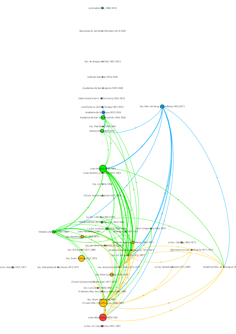
Figure 3. Network visualization where nodes are 19th century Mexican societies and edges represent the number of common members between them
Yet, even when I created an interactive graph with Sigma.js it was very hard to read the quantitative differences between my nodes’ connections. On the one side, I was interested in creating a visual display that allowed interactivity, providing end-users with both additional information for each data-point and the possibility to select specific ranges of the network. On the other, I wanted to control the order of my data and the quantities’ color-coding for readability. The solution was provided by a Python-library, Bokeh.
Results
The first visual I created was a co-occurrence matrix where each literary association was compared against all others. This display allowed me to understand how many members each pair of associations had in common. In order to enhance the identification of meaningful co-occurrences, I followed the principles of sequential color schemes –where low data values are represented by light colors and high values by dark ones (Wyssen, 2014) – and I assigned different colors and alphas according to the quantities’ distribution of my data: associations’ pairs above or equal to five common members were coded in red, and below five, in blue (see Figure 4). Additionally, I set different and consecutive alpha values to each glyph according to their exact value (intersections of less density had lower alphas). This display was helpful to address the question on the diversity or homogeneity of literary societies: with this tailored visual I was able to identify the homogenous hub of ten literary associations around the Liceo Hidalgo that had a considerable amount of common members, suggesting that although they had different approaches they were nonetheless constituted by recurring members (cf. Figure 5).
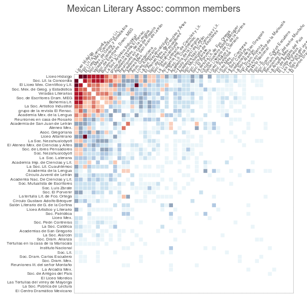
Figure 4. Co-occurrence matrix of literary societies ordered by the sum of common members with other associations
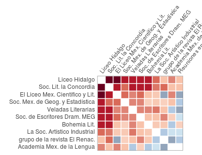
Figure 5. Selection of societies with the highest common-members’ density
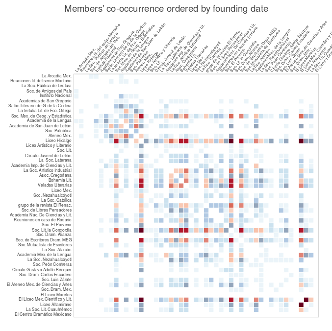
Figure 6. Associations’ co-occurrence matrix by founding date
Moreover, when I changed the order of the matrix (by founding date, see Figure 6) I was able to understand these connections in its temporal dimensions. For instance, when zooming on the glyphs for the Liceo Hidalgo (see Figure 7) one can easily identify the previous societies with which this association had enough common members to consider them as predecessors, or which other later groups could be considered as successors for the same reasons.
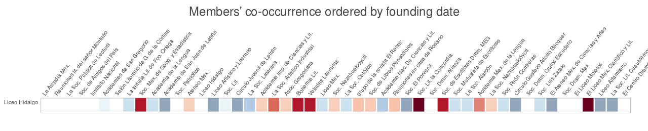
Figure 7. Liceo Hidalgos’ co-occurrences, a box-selection of the associations’ matrix by founding date
Finally, in another color coding of the glyphs (by the literary movement that was in vogue when these societies were established) I could identify which societies of the same period had more common members (see Figure 8).
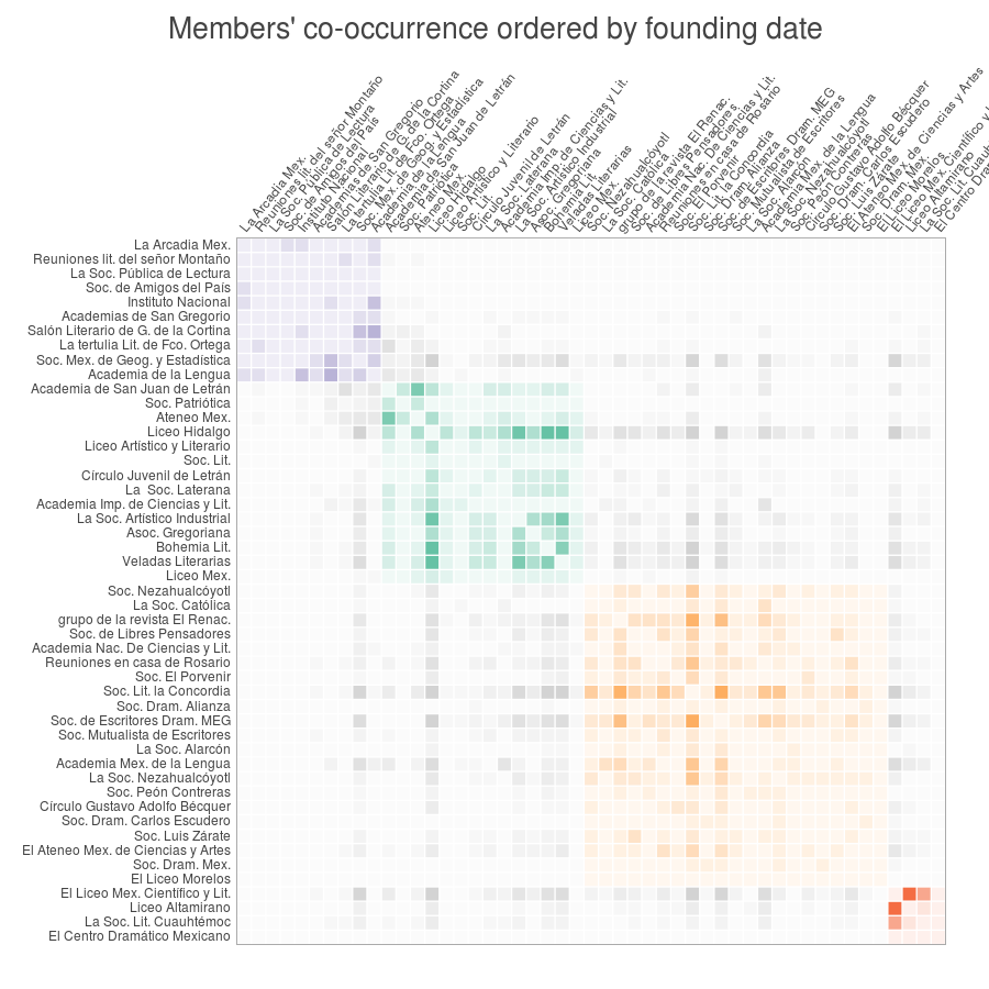
Figure 8. Societies’ co-occurrence matrix with literary movements’ color-coding.
Conversely, I created another matrix –this time comparing members— which was useful to understand which characters co-occurred more often in the same associations and thus address the second question, namely, which were the most recurrent actors in the network (see Figure 9). The result: thirteen characters formed the core of actors who were most involved (see Figure 10). This information, however, could have been obtained with a simple bar-chart. The difference in perspective that this matrix offers is that it allows the user to see that these characters were not only in many but also similar associations (which can be retrieved by hovering the glyphs), and, additionally, it makes evident how proportionally small this core is when compared to the whole matrix.
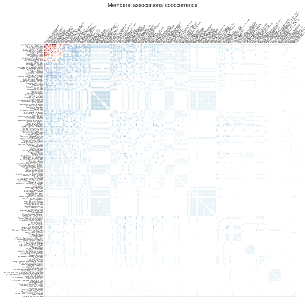
Figure 9. Members’ co-occurrence matrix ordered by maximum summed values.
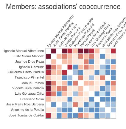
Figure 10. Members’ co-occurrence snapshot done with the selection tool of Bokeh’s visuals.
Finally, to address the second question –namely, the correlation between generations and literary movements–, I created a matrix where associations were ordered by founding date on the y-Axe, and members by birth date on the x-Axe, and where the colors were coded according to their correspondent literary movement (see Figure 11). The dark colors of the glyphs represent the literary movement of a given society (all the blue ones are from the neoclassic movement, for instance), and the light colors in the background represent the members’ generations (for example, in light orange -in a vertical division- are all the members of the Renacimiento generation). Arranging them like this enabled me to take snapshots of different societies and observe the generations’ patterns of membership-adscription. For instance, I could note that although the group formed around the Renacimiento magazine was heavily constituted by its homonym generation (see Figure 12), almost half of its members were born in the timeframe of the previous generation (coded with a light yellow background).
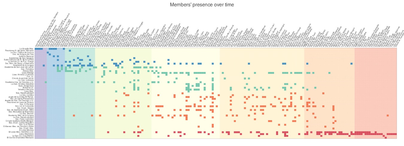
Figure 11. Generations versus literary movements: a co-occurrence matrix

Figure 12. Active members in Grupo de la Revista el Renacimiento
Conclusions
In this paper I have shown how customized visualization of modeled data can enable new readings and lead to new understandings of how societies were formed in a key period of national history. Among other things, matrices help us “see” connections between previous categories of literary history (like generations and literary movements), between societies, but also between members, thus supporting new narratives of the lettered city were the alleged homogeneity of this “elite” group can be seen in a nuanced perspective that integrates complexity without sacrificing abstraction.
- Chiu, J. (2015). An OpenRefine Reconciliation Service That Queries VIAF. Java https://github.com/codeforkjeff/refine_viaf.
- Perales Ojeda, A. (2000). Asociaciones literarias mexicanas: siglo XIX. 2nd ed. (Al siglo XIX. Ida y vuelta). México: Universidad Nacional Autónoma de México.
- Rama, A. (1984). La ciudad letrada. Hanover, N.H., U.S.A.: Ediciones del Norte.
- Sánchez, J. (1951). Academias y sociedades literarias de México. University of North Carolina.
- Spekkink, W. (2014). Event Graph Layout Wouter Spekkink. http://www.wouterspekkink.org/?page_id=93 (accessed 20 October 2015).
- Verbert, K. V. K. L. (2015). On the Use of Visualization for the Digital Humanities. Sydney, Australia http://dh2015.org/abstracts/xml/VERBERT_Katrien_On_the_Use_of_Visualization_for_t/VERBERT_Katrien_On_the_Use_of_Visualization_for_the_Dig.html (accessed 15 December 2015).
- Weingart, S. (2015). Acceptances to Digital Humanities 2015, (part 2). The Scottbot Irregular http://www.scottbot.net/HIAL/?p=41347 (accessed 23 January 2016).
- Wyssen, J. (2014). How We Created Color Scales, Website Datavisualization.ch http://datavisualization.ch/inside/how-we-created-color-scales/ (accessed 14 September 2014).
- (2012). The Salons Project Mapping the Republic of Letters. http://republicofletters.stanford.edu/casestudies/salons.html (accessed 12 November 2014).
- (2013). Berliner Klassik Geselligkeit-Datenbank Website Berliner Klassik Datenbanken. http://berlinerklassik.bbaw.de/BK/geselligkeit/Suche.html (accessed 25 February 2016).