Authors: Mathieu Jacomy, Martin Grandjean, Paul Girard
Category: Paper:Pre-Conference Workshop and Tutorial
Keywords: data visualisation, interpretation, exploratory data analysis, network, gephi
Visual Network Analysis with Gephi Workshop Collective Interpretation of DH Communities Through Twitter Networks
Gephi is a free and open source network analysis software used, among other things, in social network analysis. This workshop is intended for beginners as well as confirmed users. First, we offer an introduction to the basics of Gephi, then we explore through practice the question of visual network interpretation. We provide a dataset of both Twitter hashtags and Twitter followers graphs on various topics related to the DH community.
1. Why network interpretation matters
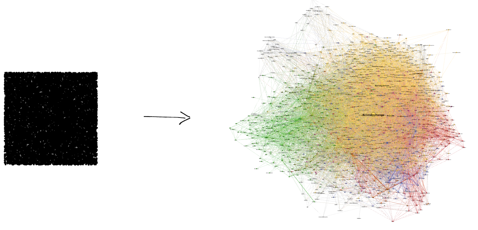
Reading a network visualization can sometimes be harder than simply producing it. Once the graph has been produced, what are we supposed to look at? Nowadays, it is common to learn how to use social network analysis software such as Gephi via online tutorials, but it is often difficult to learn how to interpret the results. Based on the experience of members of the software development team and Gephi power users, we offer this workshop to help users interpret their results.
Network visualizations are exploratory rather than explanatory. As a scholar, it is important to leverage network visualization in order to find interesting insights inside your data. Exploring a network requires mobilizing external knowledge on data’s context. Exploration is about generating, and not validating, hypotheses. Networks do not carry a single, clear message, and it is as fruitful for analysis as it is bad for communication. Dispelling this misunderstanding is very important if you want to fully benefit from a tool like Gephi.
The idea that a tool can analyze things for you is another misunderstanding we can help tackle. Gephi allows you to explore multiple facets of your data, but the interpretation remains to be done by the user him/herself. Users have to spend time with their data, and a workshop is a good place to introduce this data-care principle.
Once you know what to look for in a network, you will capable of finding insight but you still have to excavate some evidence. Network metrics are more capable of doing so than the visualization itself. In this workshop we will also learn to match visual features with metrics so that you can provide evidence for what you have seen. For instance, observed clusters are proven to be modularity clusters in the sense of Newman (Noack, 2009).
2. Workshop schedule
2.1. Part 1: Visual network analysis in a nutshell
We start the workshop with a presentation about why and how we visualize networks (Jacomy et al., 2014) and how we interpret them (Venturini et al., 2015) through a Exploratory Data Analysis method (Tukey, 1977)
2.2. Part 2: Gephi practice

In this part we explain Gephi through examples. We manipulate Gephi on screen while participants execute the same operations on their computers, using the provided datasetsAckland, R. 2013. “Web social science: Concepts, data and tools for social scientists in the digital age.” SageAckland, R. 2013. “Web social science: Concepts, data and tools for social scientists in the digital age.” Sage (Grandjean, 2015). The complete chain of usage will be addressed by illustrating Gephi features from basics (software installation, layout, data table…) to advanced (computing statistics, filtering, exporting…).
2.3. Part 3: Guided practice
Each group makes a visualization and wraps it up in a few slides using screenshots (Girard et al., 2015). The trainers provide practical help to participants.
2.4. Part 4: Collective discussion
Each group presents its findings, and we leverage these live examples to discuss the interpretation process through networks and notably its robustness compared to the visualisation choices.
This workshop is supported by DIME-WEB part of DIME-SHS research equipment financed by the EQUIPEX program (ANR-10-EQPX-19-01).
- Girard, P., Jacomy, M. and Plique, G. (2015). Manylines, a graph web publication platform with storytelling features Paper presented at the graph dev room, FOSDEM, Bruxelles, Belgique. https://archive.fosdem.org/2015/schedule/event/graph_manylines/ (accessed 14 March 2016).
- Grandjean, M. (2015). GEPHI – Introduction to Network Analysis and Visualization, Martin Grandjean. http://www.martingrandjean.ch/gephi-introduction/ (accessed 14 March 2016).
- Jacomy, M., et al. (2014). ForceAtlas2, a Continuous Graph Layout Algorithm for Handy Network Visualization Designed for the Gephi Software. (Ed.) Muldoon, M. R., PLoS ONE, 9(6): e98679 doi:10.1371/journal.pone.0098679.
- Noack, A. (2009). Modularity clustering is force-directed layout. Physical Review E, 79(2): 026102 doi:10.1103/PhysRevE.79.026102.
- Tukey, J. W. (1977). Exploratory Data Analysis. Addison-Wesley Publishing Company.
- Venturini, T., Jacomy, M. and Pereira, D. (2015). Visual Network Analysis: the Example of the Rio+20 Online Debate. Working paper. http://www.medialab.sciences-po.fr/wp-content/uploads/2015/06/VisualNetwork_Paper-10.pdf.
