Authors: Alexandre Rigal, Dario Rodighiero, Loup Cellard
Category: Paper:Long Paper
Keywords: Digital Humanities, Data Visualization, Trajectories, Actor-Network Theory, Timeline, Movement
The Trajectories Tool: Amplifying Network Visualization Complexity
1. Introduction
Network visualizations are the most complex visualizations possible, but sometimes they are not capable of describing system-complexity. Even if they are the most widely employed visualization techniques, they still have limitations. Indeed a) their relations are not sufficient to analyse complexity and b) networks do not distinguish between qualitative differences of represented entities.
Starting from the actual network model, how could one manipulate this visualization to improve complexity comprehension? In this paper, we propose a solution called trajectory. The trajectory has two major points of difference compared to the network: the trajectory a) represents not only distances, but also durations, and b) it displays kinetic entities according to their evolution with time.
The discourse is articulated around these four points. Considering that networks are tools widely used by digital humanists, we propose a new language to improve the quality of represented data: a new network based on a vertical timeline. Complexification of the network visualization is not just a new language, but also a tool that would give the field of Digital Humanities the most complex of all possible visualizations.
2. Networks
How could one improve the visualization of complexity? To answer this question, we need to investigate the qualities and defects of network visualizations. A network is a wonderful way to visualize complexity: in this model, limitless relations and entities can be mapped. A network neither draws frontiers nor imposes quantitative limits to relations and entities. How does one imagine an even more complex visualization? In other words, how does one draw a “greater infinity” of relations and entities? It seems impossible indeed; the network could possess interminable relations and entities. But a trick is still possible – to enrich entities by adding a temporal dimension.
Conventionally, network visualizations are created considering the interdependence between distance and attraction, i.e. the spatial relationship. In fact, network visualizations are stable images, keeping each entity immobile, without possible evolutions. Changes in connections and disconnections of entities happen because of temporal events taking place in reality. So, if we want to achieve an even more detailed representation of complexity, we need to introduce another dimension for relations and entities – the dimension of time.
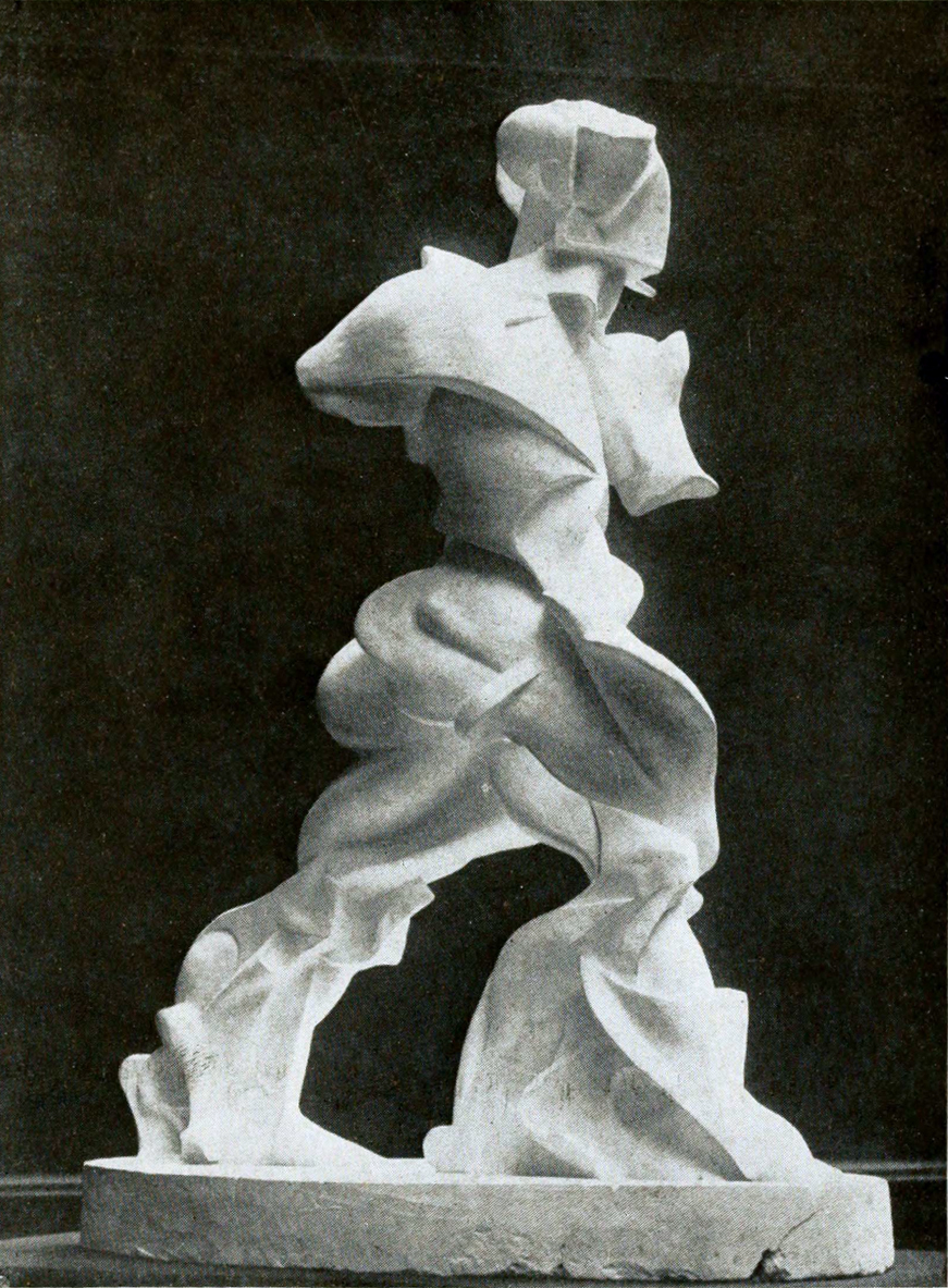
Time and space are intimately linked through movement. To enhance the richness of the visual language, we need to visualize the movement of entities through static simulation, as done in Spiral Expansion of Muscles in Action by Umberto Boccioni, the Futurist artist who introduced the art of depicting sculpture in movement (Figure 1). We do not need to draw more actors or relations, it is enough to improve their representation with a more elaborated shape. In this way, complexity will be managed not only in terms of infinite spatial entities and relations, but also in terms of infinite time-based entities and relations.
3. Movement and complexity
If network visualization is to represent movement, it needs the fluidity through a new dimension of reality. This is the reason why relations and entities have to be both spatial and time-based. Movement lends a continuity to time and space, and is the key to better understand the representation. Consequently, the aim is to visualize the evolution of entities through a sequence of time-based networks.
Formerly, Kandinsky had noticed that nodes are fixed (1947, 32-35). To create dynamic visualizations, these nodes should progress. Now, network visualizations enriched by time could be said to be in motion. Visually speaking, network entities are represented by points; giving them a movement signifies that the points have to be represented through lines (Kandinsky 1947, 57; Ingold 2007). This solution allows us to lend more complexity to the basic point representation. Moreover, Kandinsky claims: “Considered in terms of substance, it [the point] equals zero” (1947, 25). The contrast between the point and the line in network visualizations finds another analogy in the Kandinsky’s thoughts, who considers the line as the antithesis to the point: “The line is, therefore, the greatest antithesis to the pictorial proto-element – the point” (Kandinsky, 1947: 57).
Thanks to the line representation, continuity enters the complexity of representation as the fabric stitching together the narrativity of several network sequences. Moreover, continuity implies an inherent relationship between both distance and duration. If the network visualization tends to be infinite in terms of spatial relations and entities, it is fairly weak to highlight time, another infinite dimension. The introduction of the trajectory brings another dimension to the visualization: the infinity of durations of relations and entities.
4. The visualizations in practice
Data are extracted from Infoscience, EPFL’s publication repository. This repository is public, and everyone can access it and obtain the data presented in this paper. Technically speaking, we queried all publications associated with the DHLAB.
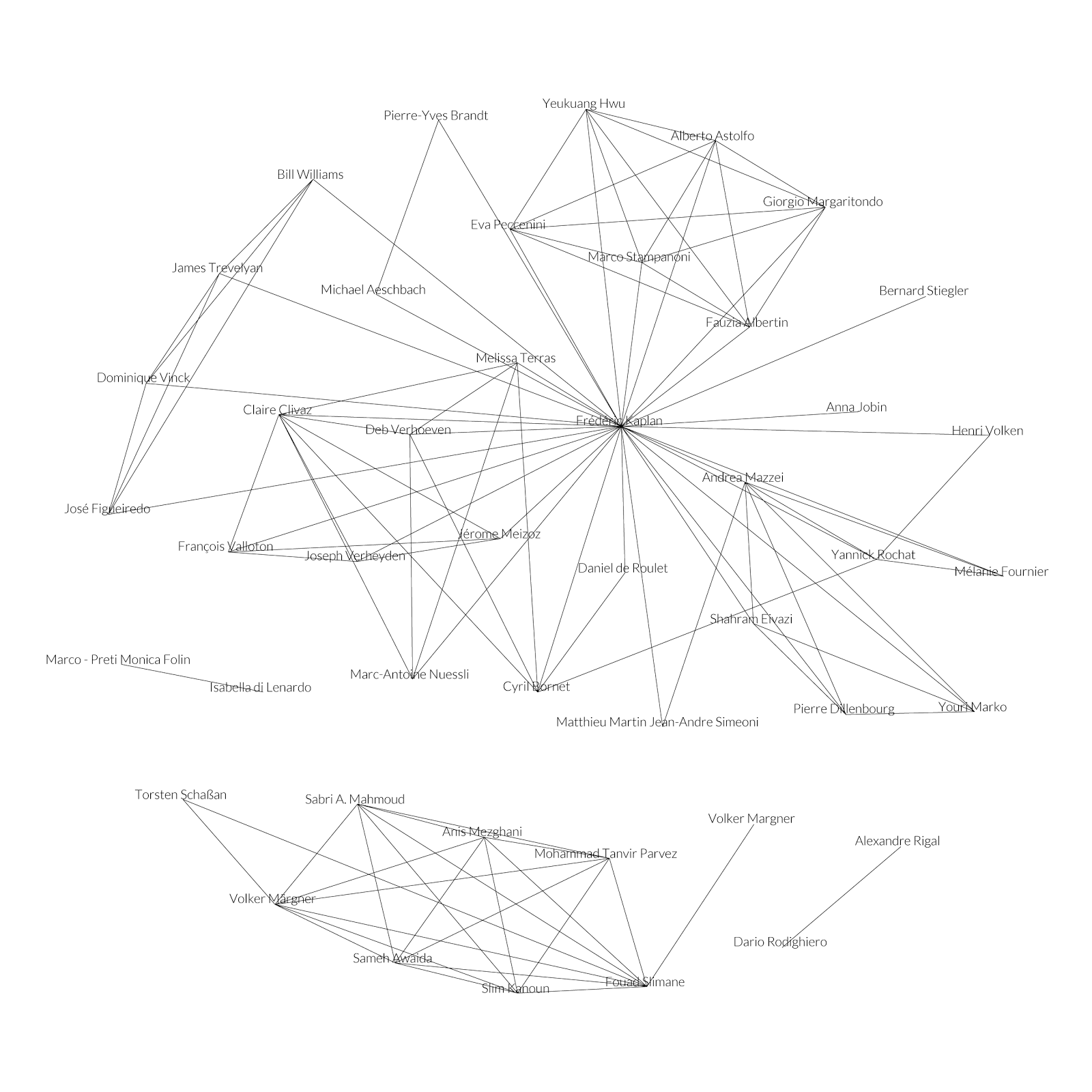
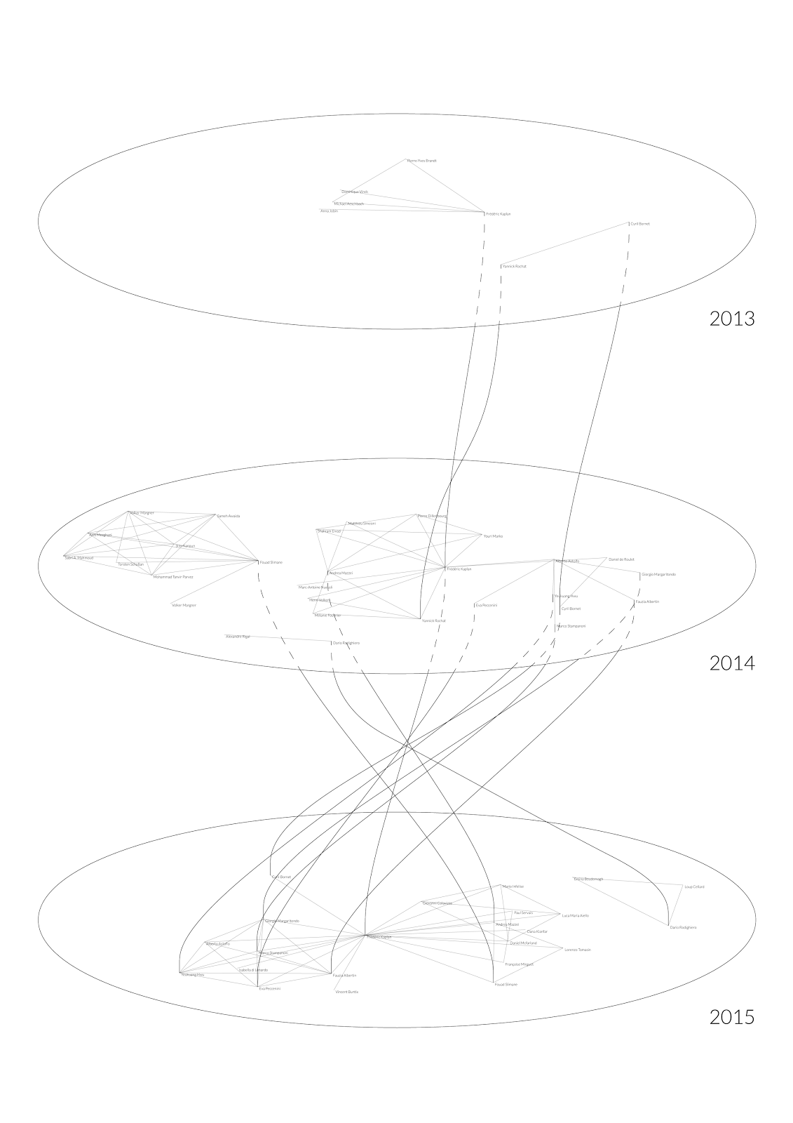
This article has two figures representing the DHLAB in Lausanne. Both visualizations present the same information in two different ways: the first shows collaborations on a plain surface – this figure is a classical network visualization (Figure 2); the second is based on the trajectory idea: points previously arranged on a flat surface are transformed into lines reifying the continuity of people (Figure 3).
If we affirm that complexity representation has indeed been “complexified”, how this could help digital humanists?
The first figure shows how the laboratory professor is placed at the center – the network would probably be very different without him and would be divided in parts. So, he is the core of the laboratory with good reason. The networks consists of two big clusters, which means that the professor is not included in all the publications of the laboratory (a rule that is compulsory in some labs).
The second figure immediately displays the literary production year by year. For example in 2013, the laboratory was relatively young to widely publish scientific works, collaborations have a greater size in 2014 and 2015. Compared to the network visualization, the trajectories depict the variability of links with time quite well by splitting the network into a sequence of networks.
The trajectories also describe the centrality of the professor better. For example in 2014, he basically worked with a group of people (shown at his left) and a colleague (at his right). In the same year, this colleague had a group of authors with whom he collaborated. Following the trajectories of that group, we can easily see that in 2014, it was not directly linked to the professor whereas in 2015, they all worked together. This is a detail revealed by trajectories that was not visible with classical network visualization.
5. The tool (conclusion)
Gyorgys Kepes wrote: “each new visual environment demands [...] new way of measuring” (1995, 13). This phrase introduces two concepts that would be of interest to the communities of Digital Humanities and Data Visualization: context and method. We could suppose that the context is given by humanists and the method by designers, but DH is the result of a blend between the two. Designers can not think of methods out of context, the opposite is true for humanists.
As Johanna Drucker says, we are experiencing “a momentary blindness among practitioners” (2011, 5). To overcome this blindness, we put together the efforts of designers and humanists: the visualization here described represents interdisciplinarity – the context and the method at the same time. For this reason, we think that trajectories are a good example. The DH community is close to having the sensibility to solve the interdisciplinarity issue.
For this reason, theory has to be combined with practice to produce solid research tools for the DH community. Trajectories are not simply a theoretical concept but also a tool that will be presented at the DH 2016 conference and which will be available to digital humanists for decomposing their networks, or, in other words, to lend representations their complexity.
- Biber, D. (1988). Variation Across Speech and Writing. Cambridge: Cambridge University Press.
- Boccioni, U. (1914). Manifesto of Futurist Sculpture.
- Drucker, J. (2011). Humanities approaches to graphical display, Digital Humanities Quarterly, 5(1): 1-21.
- Holme, P. and Saramäki J. (2013). (Eds.) Temporal Networks. Understanding Complex Systems. Berlin, Heidelberg: Springer Berlin Heidelberg.
- Ingold, T. (2007). Lines, A Brief History of Lines, Routledge, London.
- Lima, M. (2014). The Book of Trees: Visualizing Branches of Knowledge, Princeton Architectural Press, Princeton.
- Kandinsky, W. (1947). Point and Line to Plane, The Solomon R. Guggenheim Foundation for the Museum of Non-Objective Painting, New York.
- Kepes, G. (1995). Langage of Vision, Dover, New York.
- Meeks, E. (2015). D3.js in Action. Shelter Island, NY: Manning.
- Meirelles, I. (2013). Design for Information. Rockport Publishers.
- Munster, A. (2013). Anaesthesia of Networks: Conjunctive experience in Art and Technology, MIT Press, Cambridge.