Authors: Shinya Saito, Keiko Suzuki
Category: Paper:Poster
Keywords: Data-visualization, Ukiyo-e, infographics, visual features, similarity
Development of a Support Tool for Categorizing Ukiyo-e’s Pictorial Themes: A System to Deal with Visual Features and Similarities
1. Introduction
This research aims at supporting categorization of ukiyo-e (Japanese woodblock prints) by developing an original, data-visualization system. As a part of the system development, this case study focuses on the prints’ visual features—how the system can help analyzing them by simulating the analytical process. Our investigation of the ukiyo-e research’s process helps us identifying what the researchers actually need to know and how to deal with it.
2. Research process
For developing the system, we take an example of pictorial theme of “Otohime,” who is these days explained as a mythical princess, living in Ryugu or the Dragon Palace at the bottom of the sea. Princess Otohime or comparable others related to the Dragon Palace have appeared in many stories with versions and variants through history, whose prolificness their ukiyo-e imagery reflect. Thus, we need to pay our attention to this kind of pictorial themes’ extensibility in intertextuality, or in this case, inter-imagery, by which one image refers to, exploits, or recycles another. For comparing and analyzing the heroin’s visual features thoroughly, the following 9 visual features of hers are chosen as indexes: 1. headdress; 2. hairstyle; 3. frills; 4. scarf; 5. Chinese fan; 6. Chinese-style clothes; 7. collar; 8. apron; and 9. Urashima. Checking the indexes leads researchers to understand the degree of similarity in different ukiyo-e prints, and generate hypotheses about what kinds of factors affect specific ukiyo-e production as well as historical changes in Otohime’s overall imagery.
3. System development
Recently, data visualization, both its technology applicable for many fields and methodology, has been systematically developed (Mazza and Berre, 2007; Tufte, 1983). In order to pursue the above-mentioned purpose, we are developing the SALOMONIS system (Fig.1) which can load an ukiyo-e dataset encoded in JSON (JavaScript Object Notation) format. The following list shows how SALOMONIS visualizes the data.
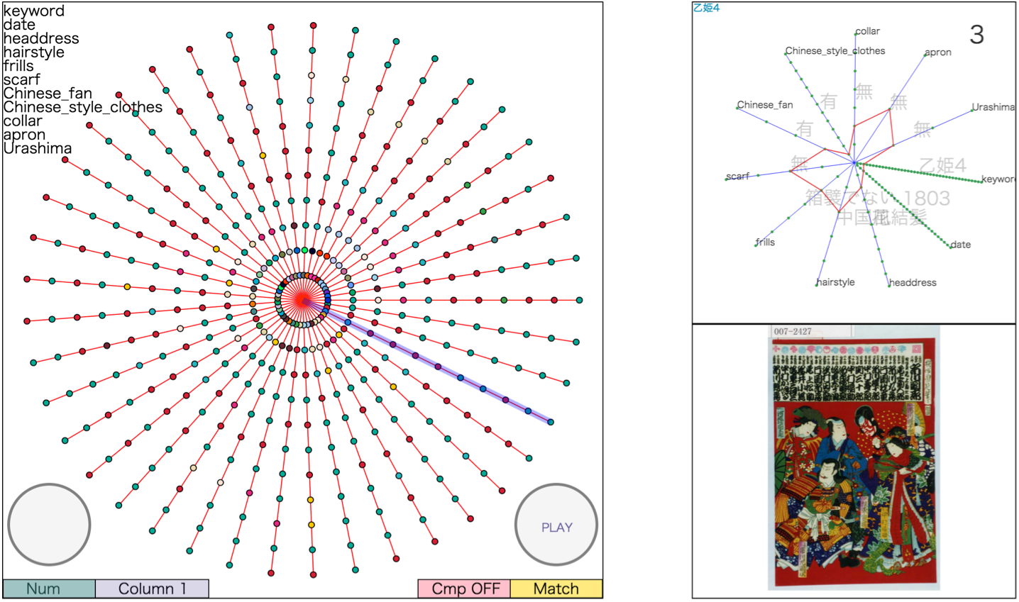
A. Entire dataset and records
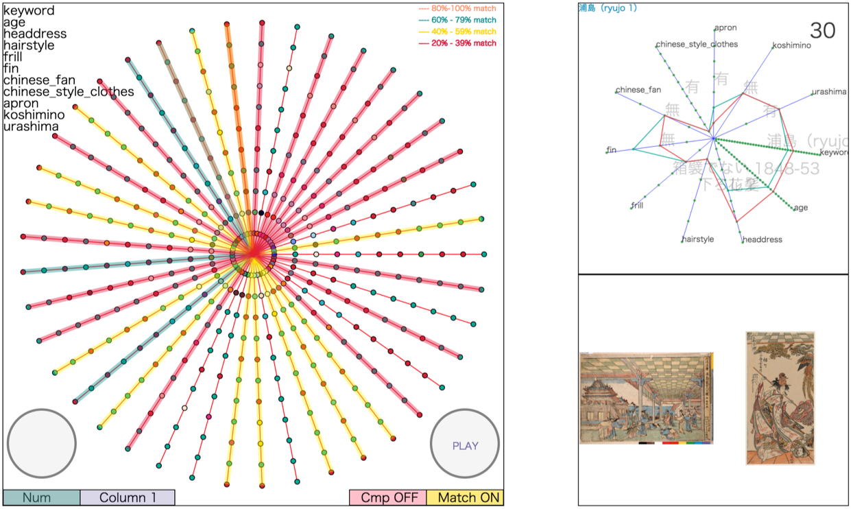
In the system, a record is visualized as a line, each of which is arranged in a radial manner. As a result, SALOMONIS visualizes the records, i.e., the entire dataset, as a circle (Fig.2).
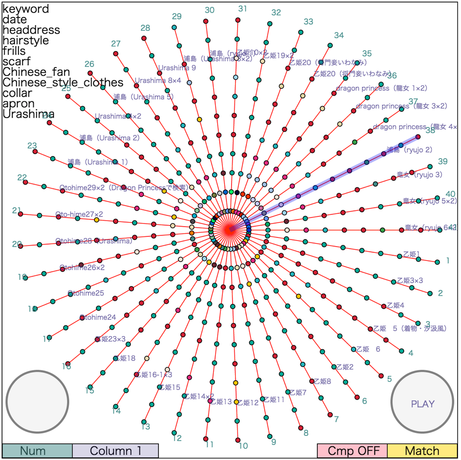
B. Columns
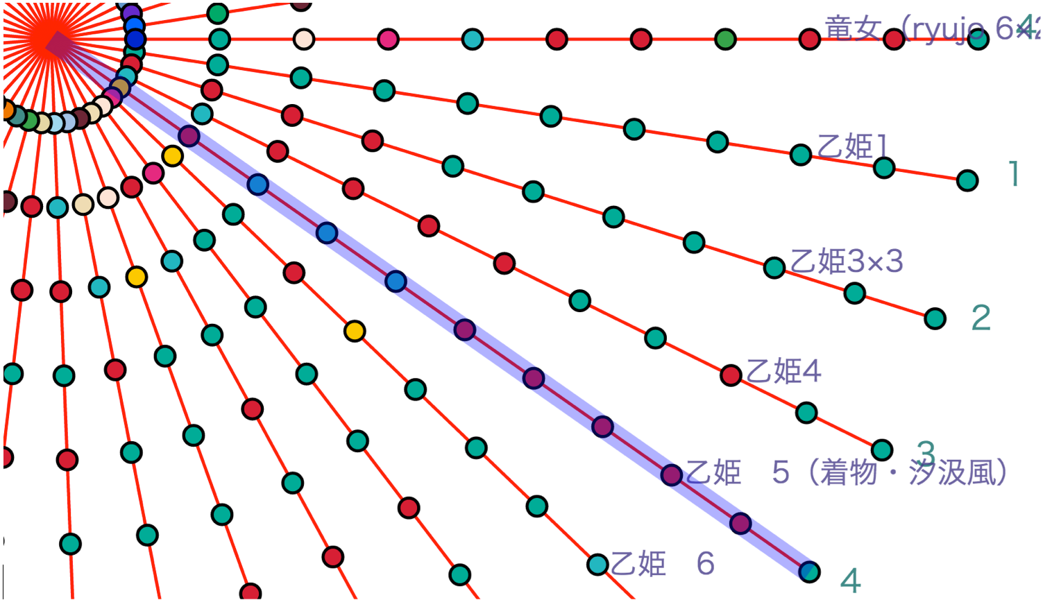
As mentioned above, a line indicates a record, and each record includes columns that correspond to indexes. Our system visualizes columns as dots, plotted on the line. Each color of the dots indicates different value of the column.
In the case of the Otohime dataset, it has 41 records and 11 columns with 9 visual features and the print’s production year and keyword. Therefore, 41 lines are arranged, each of which has 11 dots (Fig.3).
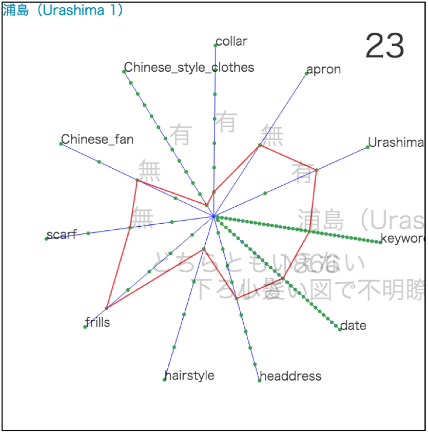
C. Interactive function
As each line is linked to an ukiyo-e print, when the user puts the mouse cursor on a certain line, a chart appears with its corresponding ukiyo-e’s 9 visual features plus its production year and keyword, mentioned on the above (Fig.4). Using this interactive function, the user can compare ukiyo-e in a speedy and accurate manner.
D. Similarity-screening function
When the user chooses one ukiyo-e as a reference point, then pushing the “Play” button, the system starts automatically screening how the other ukiyo-e are similar or not to the chosen one. Depending upon the degree of the similarity, lines of the ukiyo-e appear highlighted with colors. For example, when one ukiyo-e shares 80 percent or more similarity with the chosen one in terms of the visual features, the line appears in orange. In the case of 60 percent or more, green; 40 percent or more, yellow; and 20 percent or more, red (Fig.5).
E. Visual Sort function
Furthermore, this system has visual sort function. Using this, all records are sorted based on the similarity in a radial manner.
4. Discussion
The system proved its efficiency as it not only saved the time for the analyses but also suggests new ways to think about the prints. Right now, however, we are still in the developing stage, planning to test the system by applying it for more cases.
- Mazza, R. and Berre, A. (2007). Focus group methodology for evaluating information visualization techniques and tools, Proceedings of the 11th IEEE International Conference on Information Visualisation, pp. 74-80.
- Tufte, E. (1983). The Visual Display of Quantitative Information. Cheshire, CT: Graphics Press.
