Authors: Tommaso Elli, Giovanni Moretti, Rachele Sprugnoli, Michele Mauri, Giorgio Uboldi, Sara Tonelli, Paolo Ciuccarelli
Category: Paper:Short Paper
Keywords: data visualisation, communication design, comparison of points of view, political studies
Visualisation Strategies for Comparing Political Ideas with the ORATIO Platform
1. Introduction
Data visualisation has become one of the most relevant DH topics, due to the advent of Big Data in Humanities research practices, and to the need to make complex statistical analyses accessible to users without a technical background. Although several visualisation libraries, such as d3.js, are now freely available online and are relatively easy to use, it is still a challenging task to provide simple and effective interface design, avoiding both over-complex and over-simplified solutions. When the data to be displayed have undergone complex processing, for instance automated text analysis, it is of paramount importance to preserve all the information conveyed by such analyses, while making it understandable to the users.
In this work, we present a collaboration between communication design and natural language processing (NLP) researchers, devising effective strategies to display different aspects of the semantic content of texts. The outcome of the collaboration is the ORATIO platform, specifically developed to compare different points of view automatically extracted from text. The most challenging tasks, indeed, concerned the visualisation and the exploration of differences and overlaps detected through automated text processing.
2. Use case
Our use case concerns the comparison between Nixon’s and Kennedy’s speeches uttered during the U.S. presidential campaign in 1960. The corpus consists of 282 documents by Nixon (830,000 tokens) and 598 documents by Kennedy (815,000 tokens) 1. The overall goal of the project was to track the difference in language and content between the two opponents, and make it available through a platform which makes use of a “generous interface”: first providing all the information to the user, and then enabling him to handle the visual model through a number of options and filters (Whitelaw, 2012). Infact, in our setting, researchers are supposed to reshape and reduce the visualizations in order to prove theories or discover new interesting aspects related to the processed text. The proposed navigation pattern complies with the paradigm “Overview first, zoom and filter, details on demand” (Heer and Shneiderman, 2012).
Other existing approaches do not start from an overview, but from an empty window, where the user can build up a personal view, while investigating the relationships inside the data. We rely on such approaches in order to design the last visual model of the platform (Fig. 6), while the others take from the first one, starting from an overview.
3. ORATIO Description
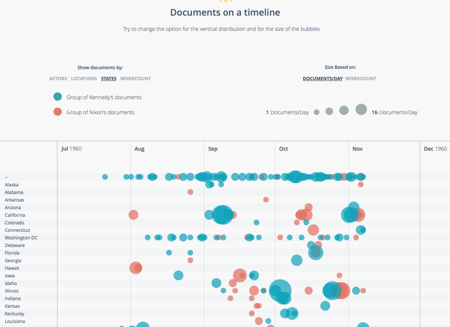
To cope with corpora richness, a multiple view approach has been adopted (Mauri, Pini, Ciminieri and Ciuccarelli, 2013): rather than providing a single view, with all the information, five different perspectives have been identified, each exploring a different piece of information in a comparative way. The first view is the Summary, whose goal is to provide the user with a general overview of the two corpora, including geographical, temporal and size information. Each corpus is associated with an imagine and a color (blue for Kennedy, red for Nixon), which remain consistent across all the platform views. Under Summary, users can see how speeches are distributed on a map (according to the place where the talk was given, included in the metadata), on a timeline (based on day of the speech in the metadata), and what linguistic features characterise each corpus (i.e. number of speeches, average words in a document and total number of words). For instance, in Figure 1 a compact representation of three corpus dimensions is given: the x-axis represents the timeline, the y-axis includes the list of cities where the speeches were given, and the dimension of the bubbles corresponds to the number of speeches uttered in a certain place at a certain time point.
The visualisation shows, for instance, that Nixon pledged to visit all the 50 States, while Kennedy did not held any speech in some States that were less critical to the victory of the elections (e.g. Hawaii or Vermont). Another interesting aspect of the electoral campaign emerging from this view is that, despite having visited less States, Kennedy was more active than Nixon: he stopped in a higher number of cities (239 cities overall, against the 172 cities visited by Nixon), and had about twice as many speeches, press releases, statements and remarks as his opponent (about 550 for Kennedy and 260 for Nixon). This is highlighted by the prominence of blue over red bubbles.
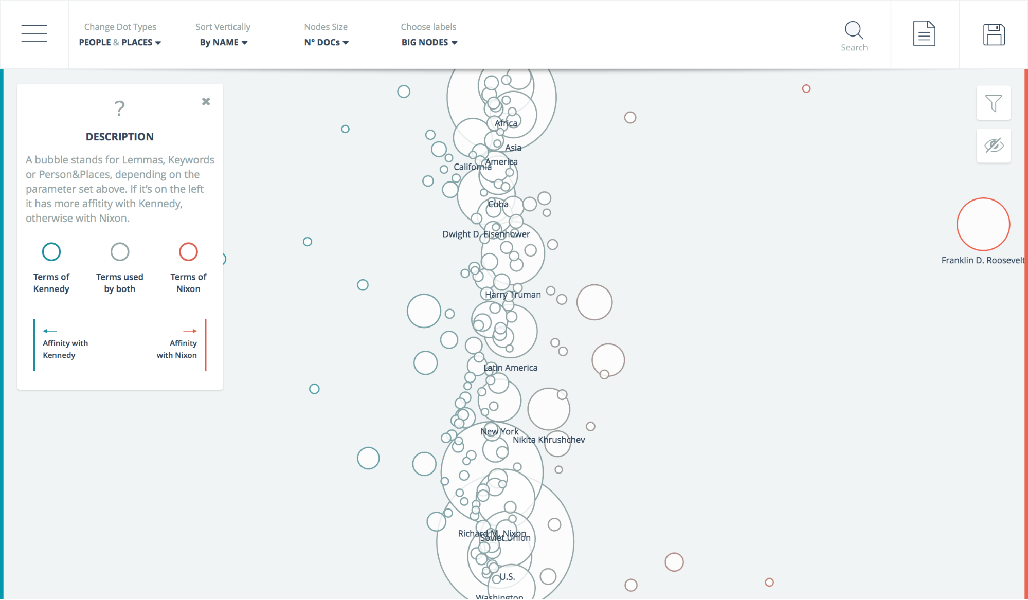
The second view, called Affinity, targets the need to understand the relevance of topics in the political debate and the presence of important differences between the two candidates. In this view, specific word classes such as verbs, keywords or persons’ names are displayed as circles, whose size is proportional to the number of occurrences in text. The more the terms occur in both corpora, the more they are displayed towards the center of the window. If they occur prevalently (or only) in Kennedy’s or Nixon’s speeches, they are displayed towards the left or the right side of the window, respectively (Fig. 2).
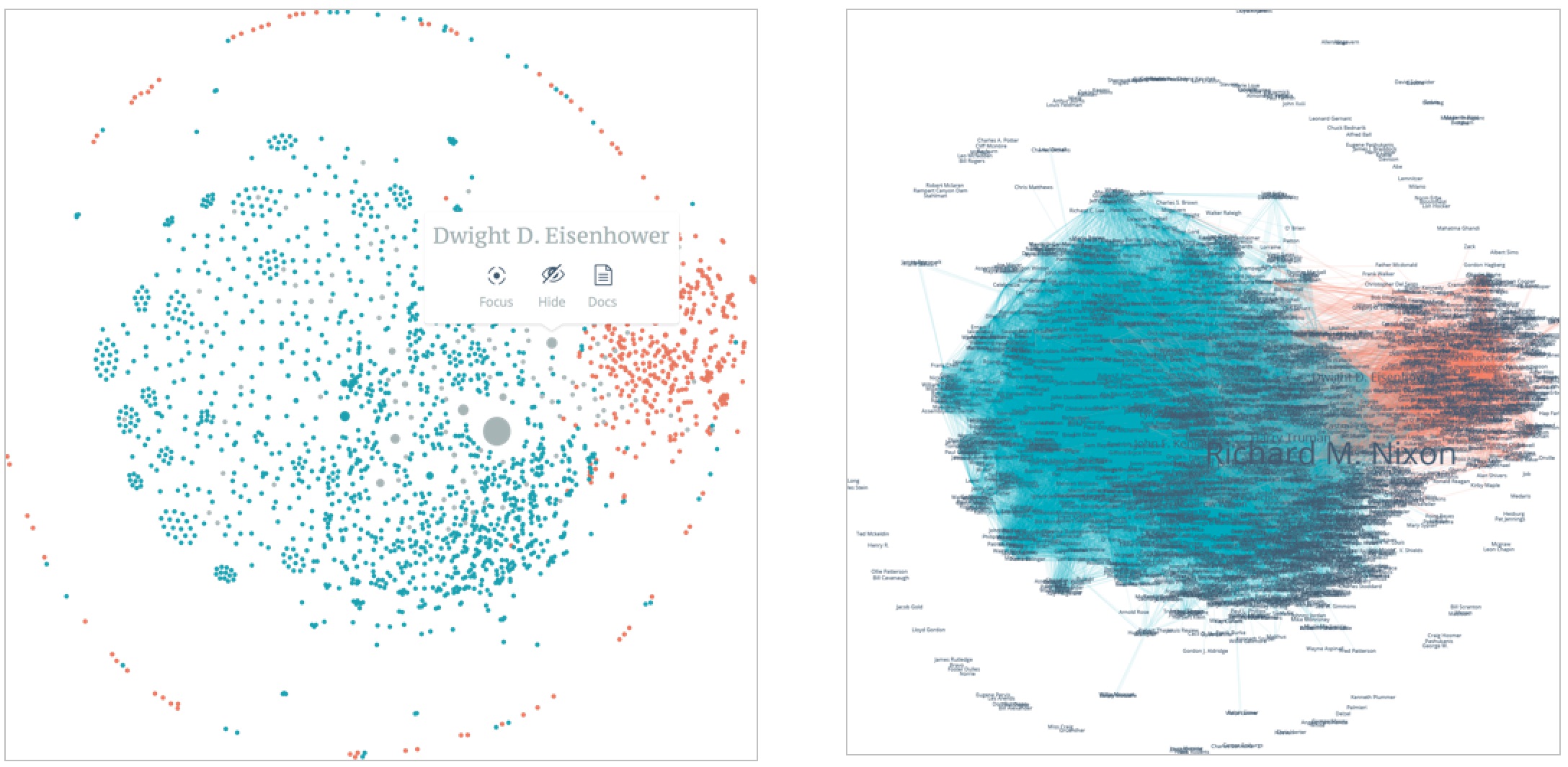
The third view, displaying People, gives a network-based representation of the people automatically recognized in the corpora by a Named Entity Recogniser (Finkel et al., 2005). If two or more people are mentioned within the same sentence, they are linked in a spatialized graph. As with the other views, users are then able to filter out elements from the visualization, in order to discover new patterns (Fig. 3a). In our specific use case, filters and other selection strategies are really useful, since the complete network is very large and difficult to read at a glance (Fig. 3b).
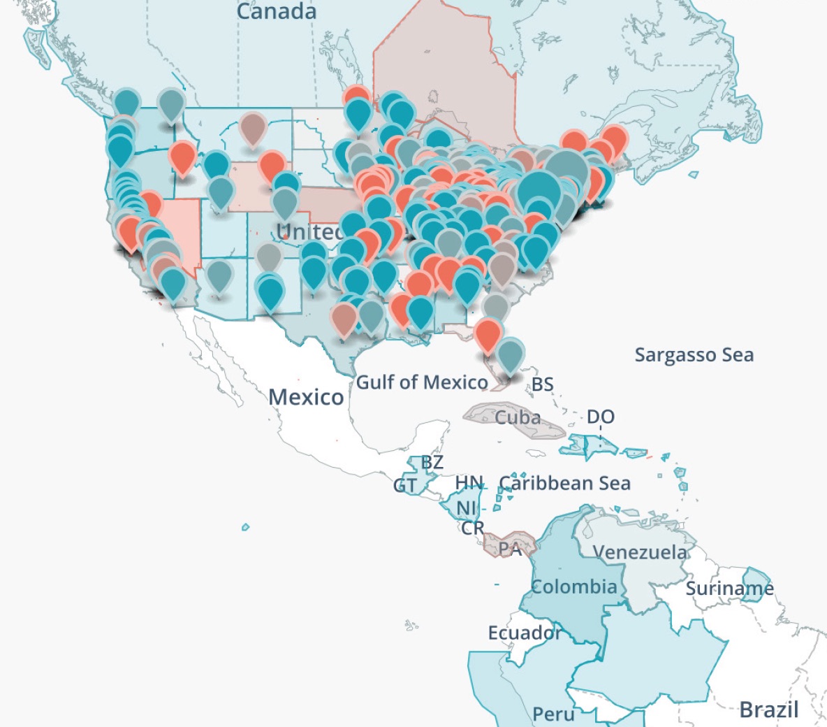
The Places view provides a comprehensive visualisation of the geographical information contained in the two corpora. It displays the metadata about the place where the speeches were uttered together with the GPEs mentioned in the speeches, automatically extracted with the same Named Entity Recogniser used for Persons. These two pieces of information are usually displayed separately, since the most widely used visualisation strategies based on heatmaps would not allow to distinguish them. However, we devised a solution where both can appear on the same map, while being easily distinguishable: the locations where a speech was uttered are marked with a cursor, while the mentioned places are highlighted on the map as colored areas. The comparison shows that Kennedy devoted more attention to specific areas outside US, while Nixon was more concerned with domestic policy. For instance, Kennedy mentioned several times places in Latin America, since one of the key themes of his campaign was the “Good Neighbor” policy, a topic not covered by Nixon.
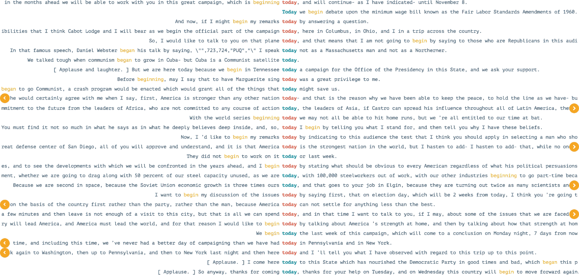
The last view, named Concordances, is inspired by linguistic research and recalls the family of concordancer tools (see for instance Kehoe and Renouf, 2002). In contrast with the previous models, this functionality takes a different approach, since there is no overview and the user is supposed to create a representation in order to answer questions and prove hypotheses. Specifically, a user can look for a particular keyword or concept and see all the sentences where it appears, typographically aligned to ease readability. In a second step, other important terms close by the given concept can be displayed as well (Fig. 5).
4. Conclusions
We presented the ORATIO platform, specifically developed to compare the content of two different corpora in the political domain. The work is the outcome of a collaboration between researchers in Communication Design and Natural Language Processing applied to Digital Humanities. Although NLP allows to process and extract information from large corpora with minimal efforts, it has drawbacks, which are then inherited by the presented platform. For instance, persons’ nodes (Fig. 3) need to be disambiguated in order to merge nodes representing co-referring mentions (e.g. “J. F. Kennedy” and “Jack Kennedy”). Also geo-political entities (Fig. 4) require disambiguation and geo-referencing. This was performed completely automatically, but errors are possible, and this kind of visualisation makes it even more straightforward to spot them.
In order to address these issues, possible solutions could be to 1) give users the possibility to inspect the content of the documents containing displayed information (from distant to close reading), and then 2) give them the possibility to manually correct the displayed information (e.g. drag and drop some elements in the space, delete nodes, etc.). The development of new interfaces enabling such human intervention would be very important and represents the future direction of our research.
- Heer, J. and Shneiderman, B. (2012). Interactive Dynamics for Visual Analysis. A taxonomy of tools that support the fluent and flexible use of visualizations. In Queue, 10(2).
- Finkel, J.-R., Grenager, T. and Manning Ch. (2005). Incorporating Non-local Information into Information Extraction Systems by Gibbs Sampling. In Proceedings of the 43nd Annual Meeting of the Association for Computational Linguistics (ACL 2005), pp. 363-70.
- Kehoe, A. and A. Renouf. (2002). WebCorp: Applying the Web to Linguistics and Linguistics to the Web. In Proceedings of WWW2002 Conference, Honolulu, Hawaii.
- Mauri, M., Pini, A., Ciminieri, D. and Ciuccarelli, P. (2013). Weaving data, slicing views. In Proceedings of the Biannual Conference of the Italian Chapter of SIGCHI - CHItaly '13. New York, USA: ACM Press, pp. 1–8. doi:10.1145/2499149.2499159
- Whitelaw, M. (2012). Towards Generous Interfaces for Archival Collections. In International Council on Archives Congress. Retrieved from http://www.ica2012.com/files/data/Full papers upload/ica12Final00423.pdf
