Authors: Claude Willan
Category: Paper:Short Paper
Keywords: archives, networks, manuscripts
Faceting and Mining Network Graphs
1. Faceting and Mining Networks
The network graph is one of the best-known and overdetermined of all data visualizations. And it suffers, more than most such modes, from the problem of fetishization. When non-specialists see network graphs, which are information-heavy, aesthetically appealing, cognitively suggestive, and yet curiously hard to read, their first reactions are often along the lines of “Oh wow!”, “Cool!”, or “Neat!”. The corollary to admiration, for members of the academy, however, is often distrust.
The problem is two-fold. Critical thinkers are justly skeptical of enthusiasm, since enthusiasm can foreclose critical engagement. But the network graph’s prominence as a mode of data visualization, as featured in new outlets like the New York Times, or in prominent projects like Mapping the Republic of Letters or Six Degrees of Francis Bacon , makes it uniquely vulnerable to the hermeneutic of suspicion (see Elijah Meeks, “The Digital Humanities as Lightning Rod”). If the digital humanities are still distrusted in some more conservative corners of the academy — such as mine, eighteenth century english literary manuscript studies — then network graphs, because they have become synecdochic for digital humanities writ large, are doubly distrusted.
This short paper addresses three states of addressing this skepticism head-on, embedding network graph literacy in the context of a larger disciplinary argument. Those three stages correspond to three key perspectives practitioners of network analysis can assume when wanting to persuade skeptics of the probative value of network graphs, to show how condign those graphs are to traditional “analogue” analysis, and to build a persuasive argument within your own field.
Those three perspectives are: targeted data gathering; graph design, and argument design.
Much of my own work centers on networks of distribution of Jacobite manuscript poetry from 1688 — 1750. Once I knew that I would be using network graphs to illustrate the richness of the social and material facts I had uncovered, I started enriching my dataset with an eye to encoding metadata to reveal those richnesses as precisely as possible. Those metadata categories include size of manuscript, number of copies of each poem in circulation, names of manuscript collectors, languages contained in each manuscript, dates of manuscript, and so on. I entered this metadata on each future node in my two sets of network graphs (one of individual poems, one of manuscripts).
Graph design, the next stage, was just as important. Having settled on a layout in Gephi that I felt reliably showed relations among objects in a way that I knew I could explain simply (such as proximity as a function of similarity; distance as an index of relative dis-similarity) I then worked to combat the visual fetish character of the network graph by partitioning the nodes multiple times while keeping them within the same layout. This meant that one my audience had had time to accustom themselves to the layout, successive graphs with differing color schemes, node sizes, and edge weights would show them the facets, the richness, of the dataset. By showing the same graph layout faceted in multiple different ways, my audience could comprehend the layout as a function of multiple and overlapping functions.
Argument design, the last stage, is a way of making the procession of network graphs an intuitive progression of visual arguments that draws the audience into, and educates them about, the rhetoric of the network graph precisely by showing its malleability and, in some ways, its very partiality. By showing the protean capacities of the network graph, by showing the extent to which each network graph is itself a reading, skeptics more at home with paleography and stemmatology are able to grasp quite intuitively the resource that is faceted network graph: a flexible and powerful tool to show the richness and interrelatedness of large datasets based on archival discoveries very like their own.
This short paper will include slides of my own faceted network graphs to show how we can use this form of argumentation as a kind of nested pedagogy.
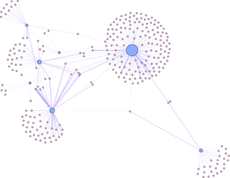
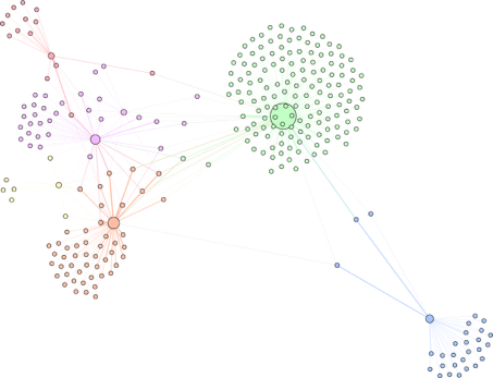
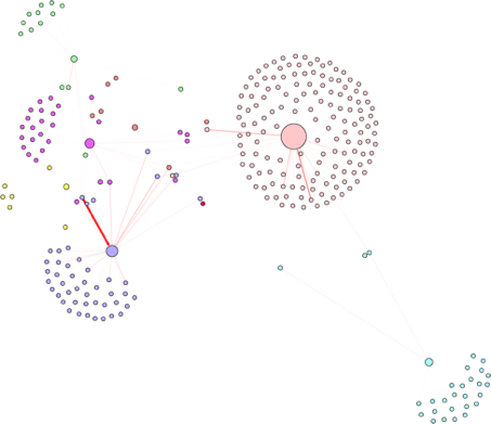
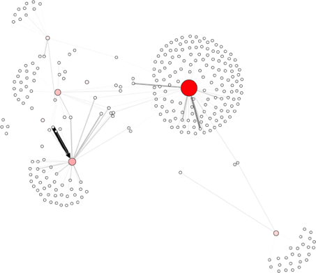
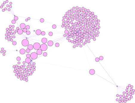
I enclose here a collection of faceted and mined network graphs made for a colleague’s project on Modernist journals. These bimodal graphs show the interrelation of different contributors to various roughly contemporary journals. By showing the same layout several times, but using node color, node size, edge weight and color, we are able to see:
which nodes are journalists and which are journals;
nodes clustered with a granularity of 1.0 (fewest communities of the largest size);
nodes clustered with a granularity of 0.23 (many smaller communities);
which journalists contributed the most (edge weight), which journals had the most contributors (node redness and size), and
which journalists contributed to the most journals (by node size).
These five network graphs taken together not only supply a much richer picture of the system of writing and publication than a single graph would; by showing the range of information that can be displayed on that graph with a series of simple adjustments, the reader is shown how the graph is a product not of vulgar scientism but of intentional humanism.
- Mapping the Republic of Letters. http://republicofletters.stanford.edu/ (accessed March 7th 2016).
- Meeks, E. (2012). The Digital Humanities as Lightning Rod. https://dhs.stanford.edu/the-digital-humanities-as/digital-humanities-as-lightning-rod/ (accessed March 7th 2016).
- Six Degrees of Francis Bacon. http://sixdegreesoffrancisbacon.com (accessed March 7th 2016).