Authors: Jean Ann Bauer
Category: Paper:Poster
Keywords: collaboration, visualization, databases, interactivity
Seeing the Argument: Visualize Your Database with DAVILA
Data modeling is a subject of study within digital humanities (Flanders and Jannidis, 2015) with special emphasis on the creative, scholarly, and normative aspects of data modeling in database design (Verhoeven, 2014; Bauer, 2015). By imagining our sources as data, and then abstracting th ose data to the point where quantitative methods gain purchase but still retain their original context, digital humanists are reimagining what it means to study the human record. While the study of data modeling is crucial to digital humanities, it is complicated by database schema conventions. Whether expressed in technical diagrams or computer code, database schemas initially present as confusing to anyone not trained to read them. Yet, schemas contain crucial information about how humanities data are translated to the computer, creating affordances for querying, browsing, and display – making direct access to schemas valuable to researchers, users, and peer reviewers.
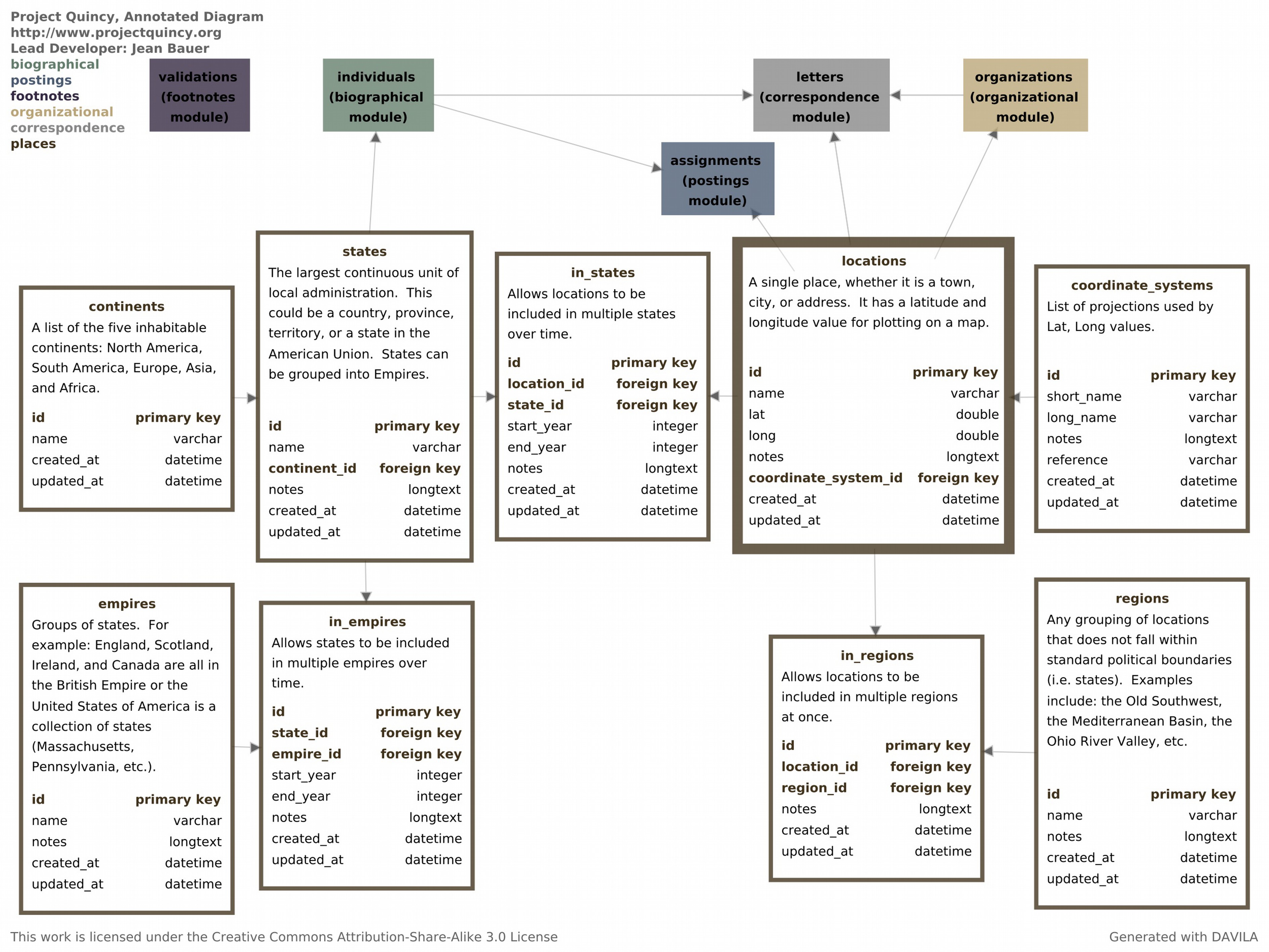
DAVILA is an open source relational database schema annotation and visualization tool created to help bridge this gap. While there are other database schema visualization tools (ex. MySQL Workbench, DbVisualizer, and DbSchema) available, DAVILA was specifically designed to function within digital humanities project teams and to document digital humanities projects for the non-technical audiences that use and review them. Drawing on the scholarly practice of annotation as well as the principles of Information Design (Tufte, 2006a; Tufte, 1997; Tufte, 2006b; Tufte, 2006c) and Computational Information Design (Fry, 2004), DAVILA creates a modified Entity-Relationship diagram (see (Ramsay, 2004) for a more detailed description of E-R diagrams) that can be used by both technical and content experts.
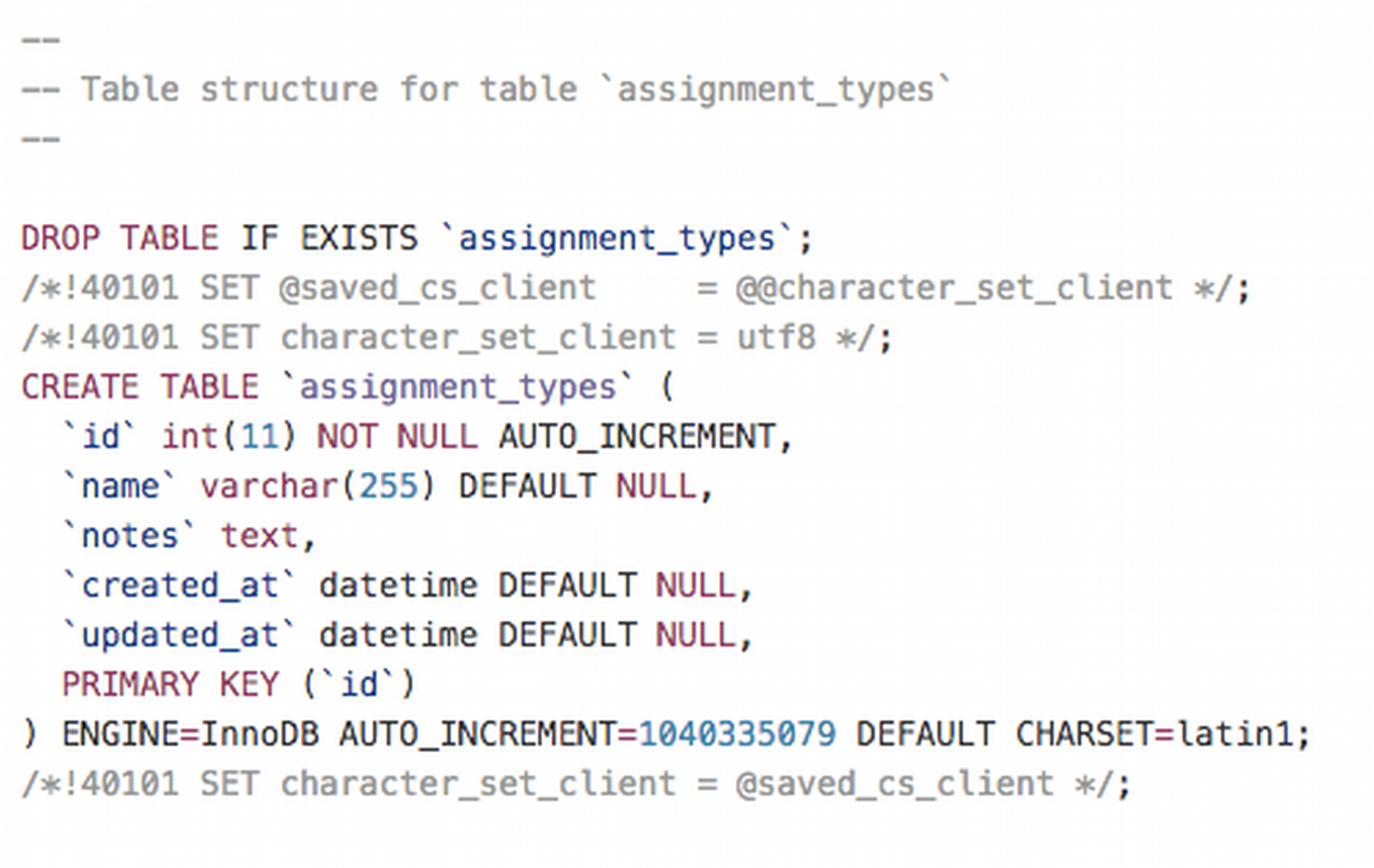
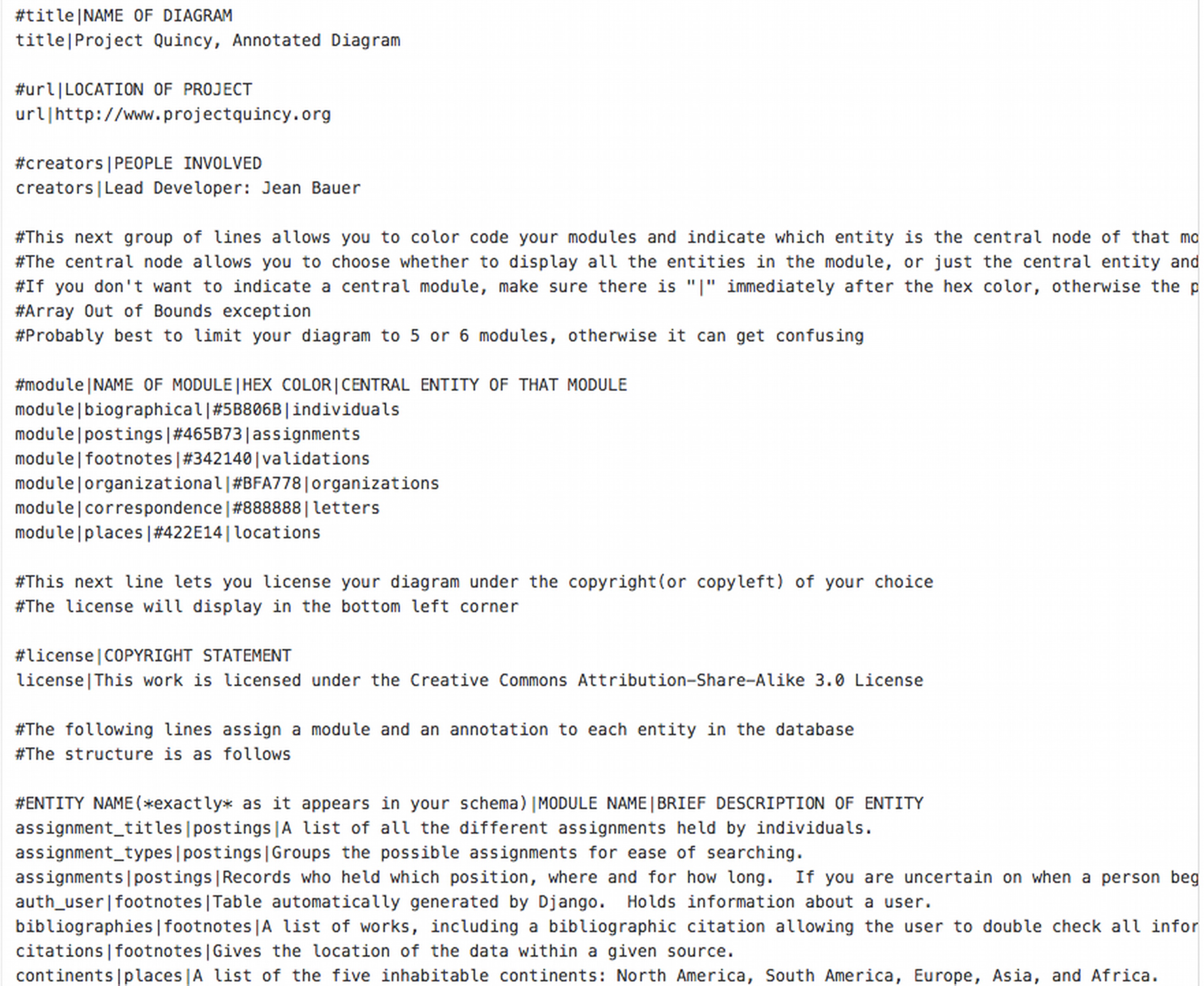
DAVILA takes two files as inputs: a database schema and an optional plain text customization file. Examples of both files are included with the software. When a schema is processed without a customization file DAVILA will create a blue box for each entity, and connect the entities based on their relationships (if specified in the schema). So, if a user is given someone else's database without documentation, she can use DAVILA to create a technical diagram from the schema. The user can then explore the entities in the interface and get a better sense of a new system. The customization file can be completed in an iterative process until the entire system has been documented.
The customization file is the heart of DAVILA, and what separates it from other database schema visualization software packages. The plain text file allows scholars to annotate the resulting diagram. These annotations begin with basic project metadata, crucial to data curation (Flanders and Muñoz, 2014) : project name, URL, developer names, and the copyright license applied to the diagrams. The customization file allows users to group entities into modules, color code those modules, indicate which entity is central to each module, and provide annotation text for every entity in the database. The annotated text is particularly crucial, describing in a sentence or two the essence of a particular entity and its relationship to the larger database. The color coding and positioning bring order to the diagram, but the annotation gives non-technical team members or peer reviewers a way into the schema.
Once DAVILA is running, users can click and drag the entities into different positions, expand an individual module for more information, or hide the non-central entities in a module to focus on another part of your schema, all in a fun, force-directed environment courtesy of the toxiclibs physics library. Pressing the space bar saves a snapshot of the window as a timestamped, vector-scaled pdf. As a visualization tool, DAVILA has limited use for a team that combines sighted and blind (or colorblind) team members. For such groups, the customization file may provide a more fruitful locus of collaboration than the visual output.
DAVILA is written in Processing, a Java-based artistic scripting language originally created by Ben Fry and Casey Reas, and released under GPLv3. Special attention was paid to documenting DAVILA itself. Each file in the program starts with at least one paragraph, in English, describing what the following code does and how to modify it as needed. This supplements the extensive inline commenting of the code, which can double as a tutorial for >Processing. Finally, there is a detailed README file which walks new users through installing Processing and using DAVILA with their own database schemas.
DAVILA-generated schemas are used to teach database design and were included in a database inflected doctoral dissertation in history (Bauer, 2015). To generate your own diagram visit.
- Bauer, J. (2015). Republicans of Letters: The Early American Foreign Service as Information Network, 1775-1825 University of Virginia Ph.D. http://libra.virginia.edu/catalog/libra-oa:9454.
- Flanders, J. and Jannidis, F. (2015). Knowledge Organization and Data Modeling in the Humanities. http://www.wwp.northeastern.edu/outreach/conference/kodm2012/flanders_jannidis_datamodeling.pdf.
- Flanders, J. and Muñoz, T. (2014). An Introduction to Humanities Data Curation. DH Curation Guide http://guide.dhcuration.org/contents/intro/ (accessed 6 March 2016).
- Fry, B. J. (2004). Computational information design. Massachusetts Institute of Technology.
- Ramsay, S. (2004). Databases. A Companion to Digital Humanities. Oxford: Blackwell.
- Tufte, E. R. (1997). Visual Explanations: Images and Quantities, Evidence and Narrative. Cheshire, Conn.: Graphics Press.
- Tufte, E. R. (2006a). The Visual Display of Quantitative Information. 2nd ed. Cheshire, Conn.: Graphics Press.
- Tufte, E. R. (2006b). Beautiful Evidence. Cheshire, Conn.: Graphics Press.
- Tufte, E. R. (2006c). Envisioning Information. Cheshire, Conn.: Graphics Press.
- Verhoeven, D. (2014). Doing the sheep good: facilitating engagement in digital humanities and creative arts research. Advancing Digital Humanities: Research, Methods, Theories. pp. 206–20.